Case study: Museum app
« How Might We help museums and other public institutions bring people closer and fulfill their mission to preserve and activate cultural heritage in the 21st century? »
I believe museums are institutions that should be close to the people, helping them find a solution to make culture more accessible is was a really interesting task.
Covid crisis was really hard on museums and they really need people to come back and visit them. So how could we improve this to make it easier and more accessible to everyone?
To answer this question we had to do research on users (surveys and interviews) we analyzed results to know more about our users and know what their needs are. The goal of this exercise was to continue the project until we made our lo-fi, tested with users and iterated. I know that in some projects i already did the High fi part, but what was interesting about this project is being focused in the user needs. All the research is published on my Medium at this address I will publish here below some elements from the research itself, including the storyboard y drew.Ce projet en UX design a été réalisé en groupe en une semaine lors de mes études chez Ironhack.
Le sujet de recherche était :
« Comment pouvons nous aider les musées et autres institutions publiques faire venir plus de monde et remplir leur mission de preserver et activer l’heritage culturel dans le 21ème siècle? »
Pour répondre à cette question on a fait de recherches sur utilisateurs (enquêtes et interviews) et on a analysé les résultats afin de savoir qui sont nos utilisateurs et comprendre leurs besoins. Le but de l’exercise était d’aller jusque le low-fi et faire des tests utilisateurs et itérer par la suite.-
Toute la recherche en question est publiée sur le site Medium à cette adresse
Je vais publier ci-dessous quelques éléments visuels de notre recherche dont le storyboard que j’ai dessiné.
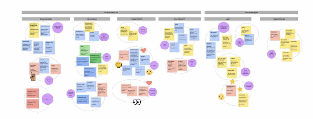
Affinity Diagram
After doing interviews we analyzed answers and did dot voting
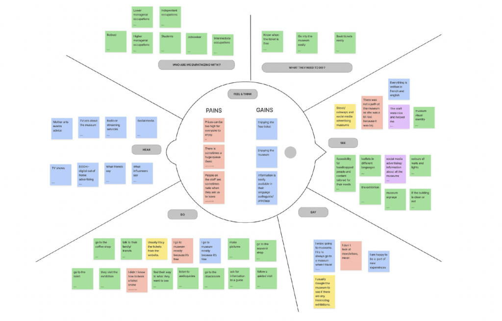
Empathy Map
Then moved to the empathy map to learn more about our users
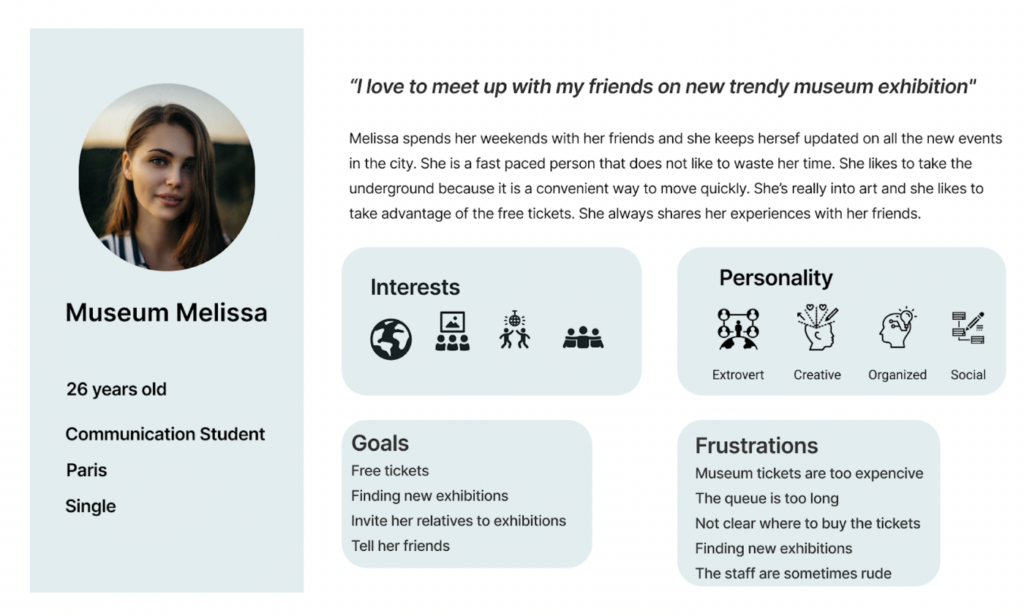
User persona
With all this information in hand we created a persona.
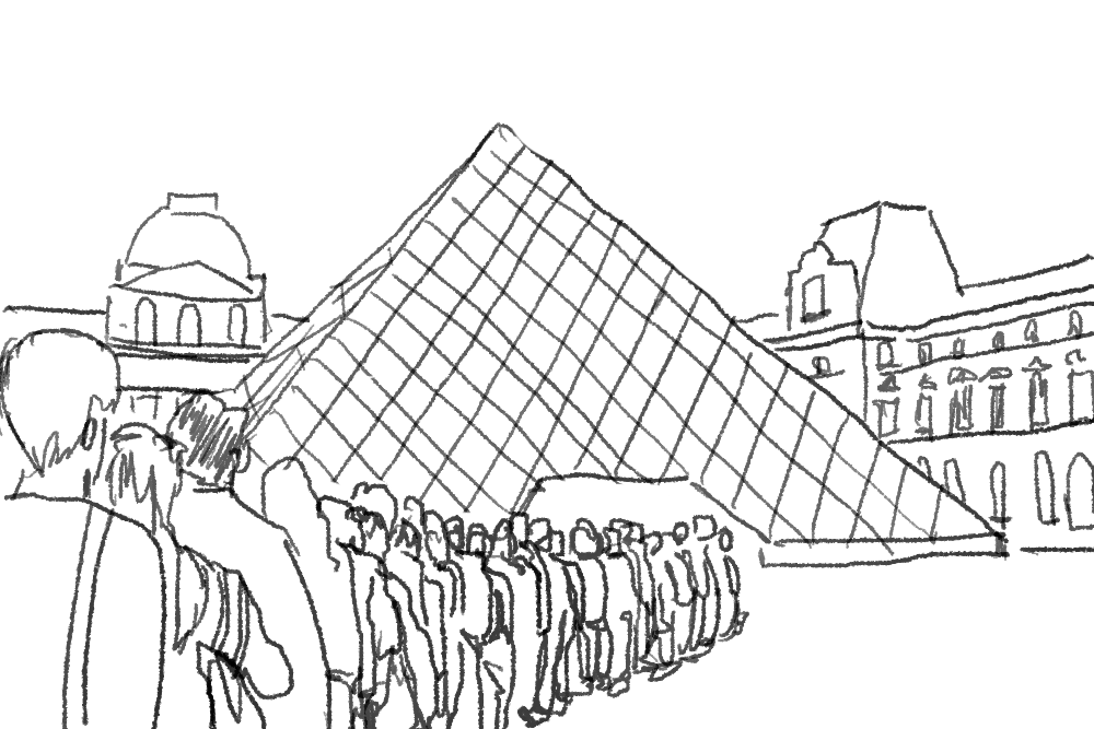
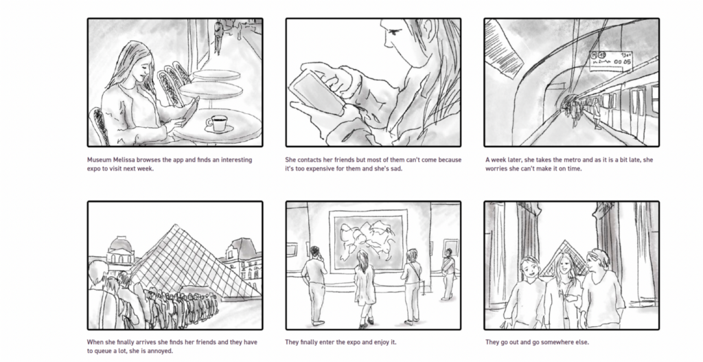
Storyboard
I drew a storyboard using the information from the user journey
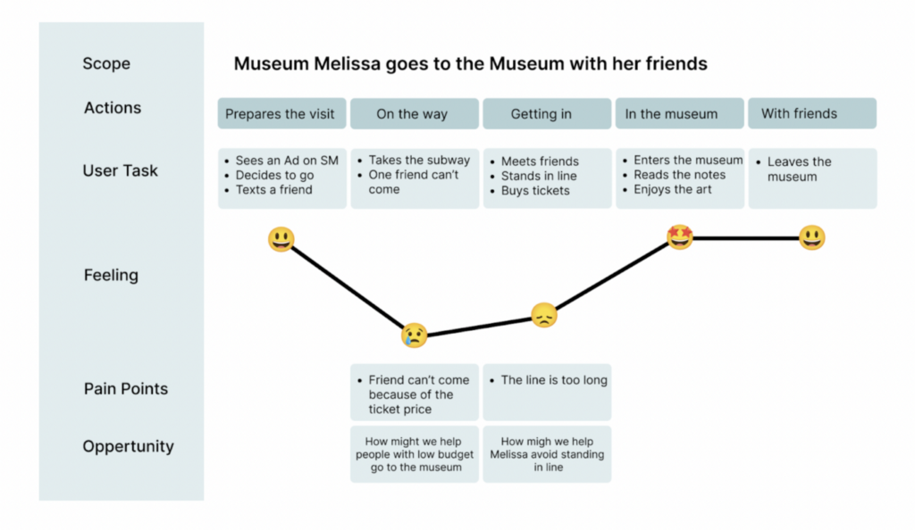
User journey map
Our user journey map shows the happy path from our user and where frustrations are and what opportunities we could explore.
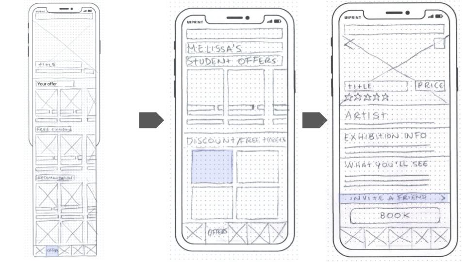
As we moved into the ideation phase we decided what were the features we needed and did things like crazy 8 to get some ideas.
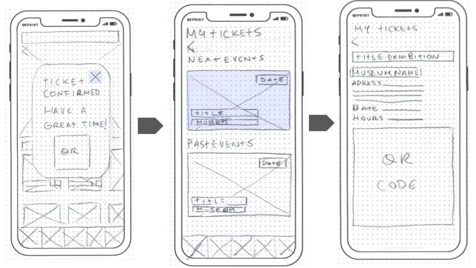
Lo fi
In our Museum app prototype the user can access all offers from museums at a glance, buy tickets and invite a friend, access all information about the place they are going, and pictures.
Prototype
We tested our prototype with users then iterated from the previous version. With only one week we did not have enough time to go further on this project.
To test the prototype you can click the link here below


