Le tiers mythe
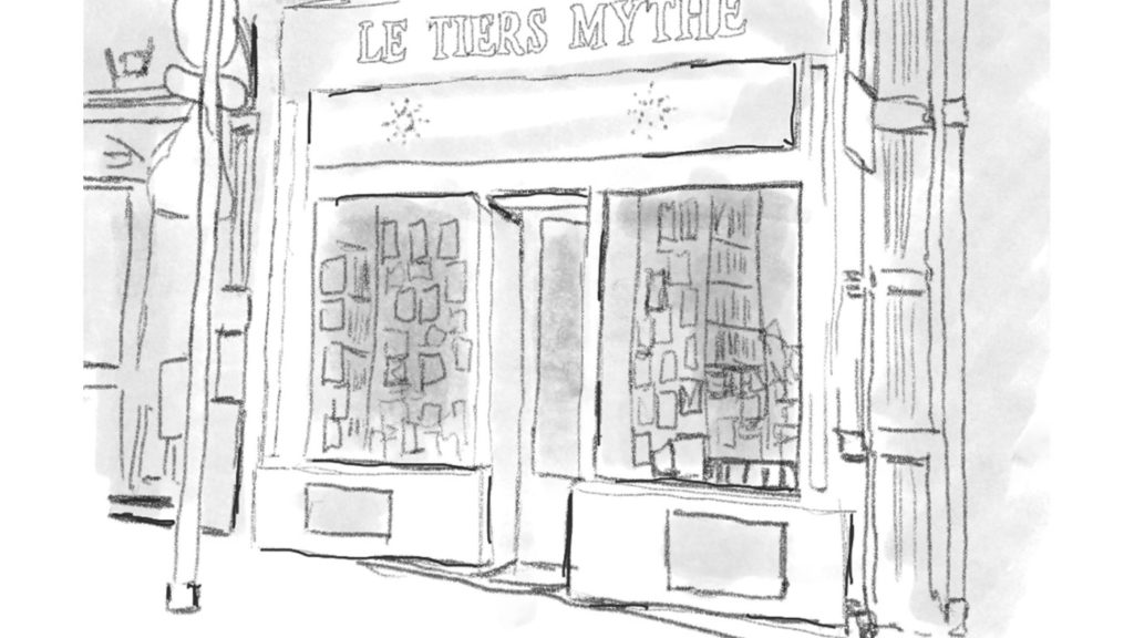
For my second project at Ironhack i worked with a group for two weeks on an e-commerce project for a real life client.
Below you can see parts of the research for this project.
The whole project is described also in my medium page.
Our client was a small bookstore « Le tiers mythe », they sell books about middle east. They were in need of a better website and we interviewed the owner, the clients and potential clients. We also conducted surveys to know what their needs were.
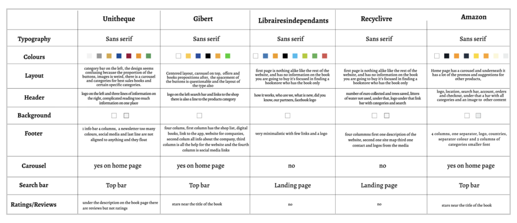
We conducted business analysis, market research, visual competitive analysis, in order to know who the competitors were and what opportunities there were.
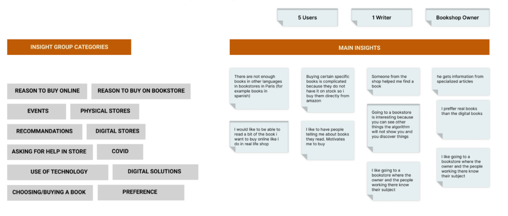
Interviews and affinity map research
These were the main results of our quantitative and qualitative reseach.
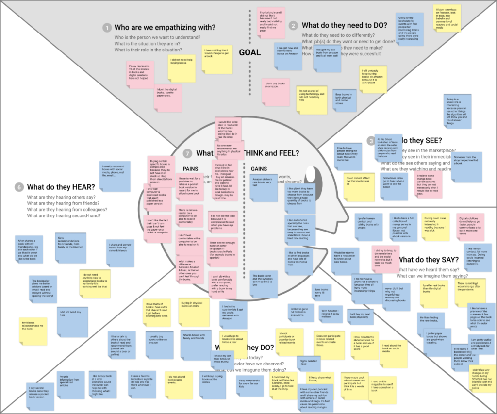
Empathy map
Using all this information we created an empathy map and tried to understand the user’s needs and frustrations.
User persona
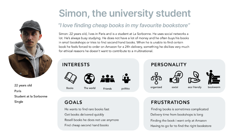
We created two personas, but the main one was Simon, a student that needed to find rare books on this category fast.
User journey
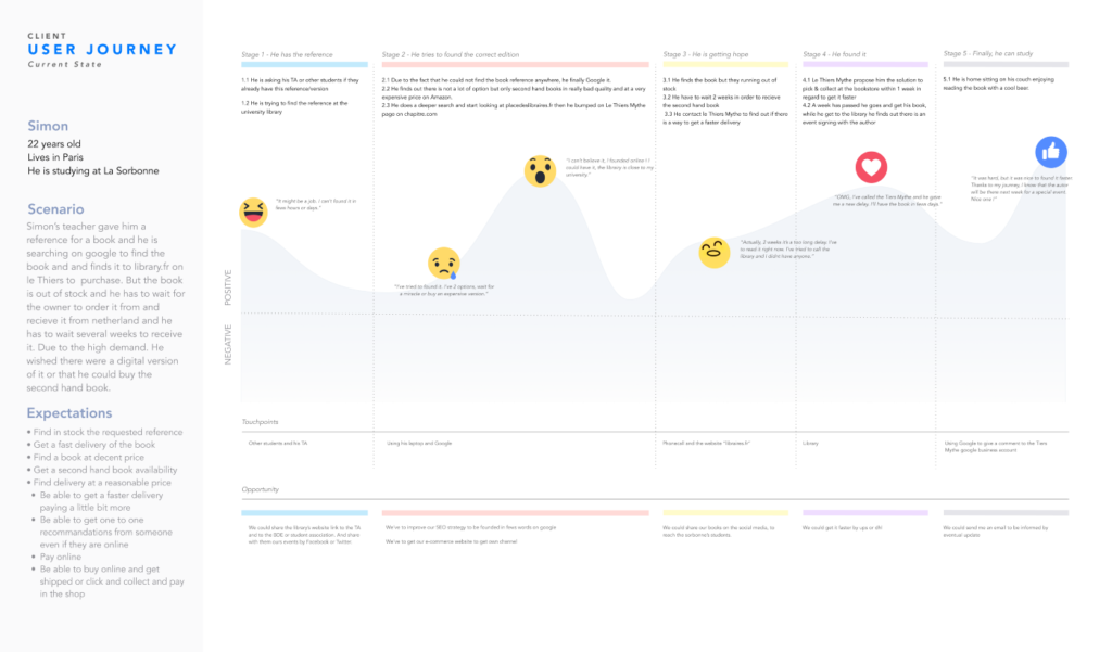
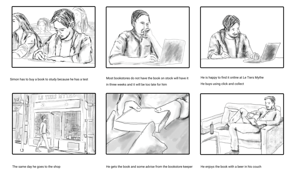
We created the user journey map and i drew the storyboard.
Storyboard
With all this information we finally had a problem statement and an hypotesis statement.
Problem statement
Young Researcher needs a way to find, order and recieve a specific book because It’s hard, expensive or not friendly to find it elsewhere. We will know that we reached our goal if he buys the book and keeps coming back for other books.
Hypotesis statement
We believe by making book search easier for students will achieve help Le Tiers Mythe grow it’s business. We will know we are right when there is 10% more sales for students in the next 6 months.
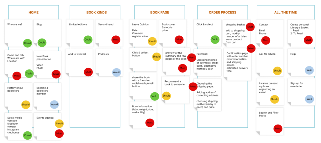
MosCoW
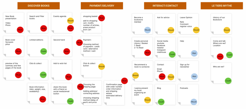
We defined what we needed to include on our first mockups or not.
Zoning
MVP
The goal of Le tiers mythe website, at the bare minimum, is to let readers easily find old books and limited editions and find out about recently published books on middle east and order or Buy them. the website further aims to encourage and keep human interaction between bookseller and writers, bookseller and readers and among readers .
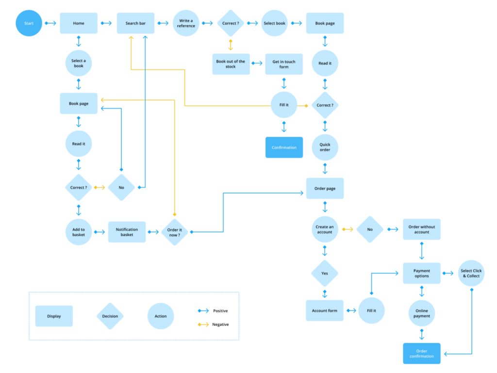
User flow
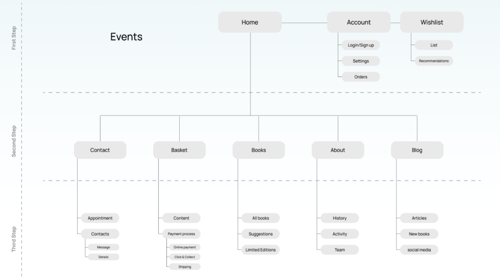
We defined our user flow and a happy path and site map.
Site map
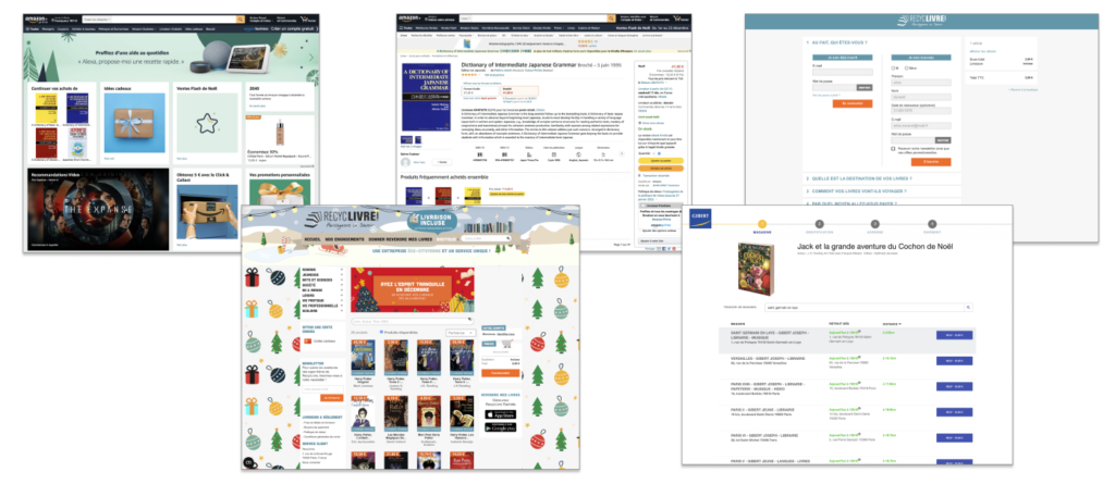
visual research
This part really helped us to know what clients expect to find on these websites, what is working, what is not and move foward by creating a moodboard, finding brand attributes and so on.
Lo-fi
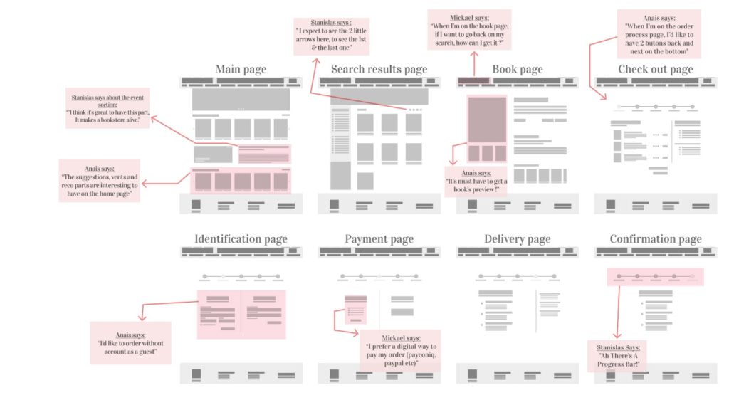
After starting the ideation phase, we made a lo-fi and let the users test a first version of the website. We had many results that allowed us to iterate and go into a mid-fi version.
Mid-fi
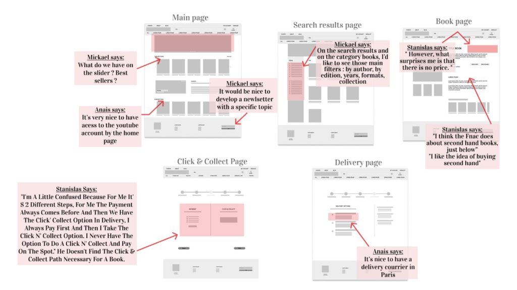
Our mid fi had a few evolutions after the iteration and then iterated some more before creating the hi-fi, we tested again with users and their comments were really helpful.
Hi-fi
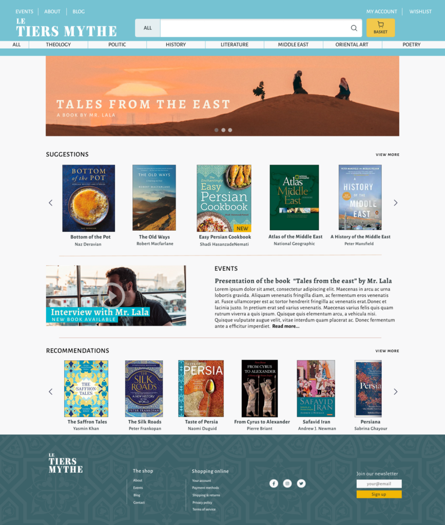
After a first version of the hi-fi and the presentation i had more comments from users so i decided to iterate again and the result is a website where you can easily find books and also see events from the store related to authors and books.
Our happy path leads the user from the main page through the payment process.
The book page can show all information of the book in an easy way (availability, book info, book awards, reviews, pictures, recommendations, if the book is new or not, etc).
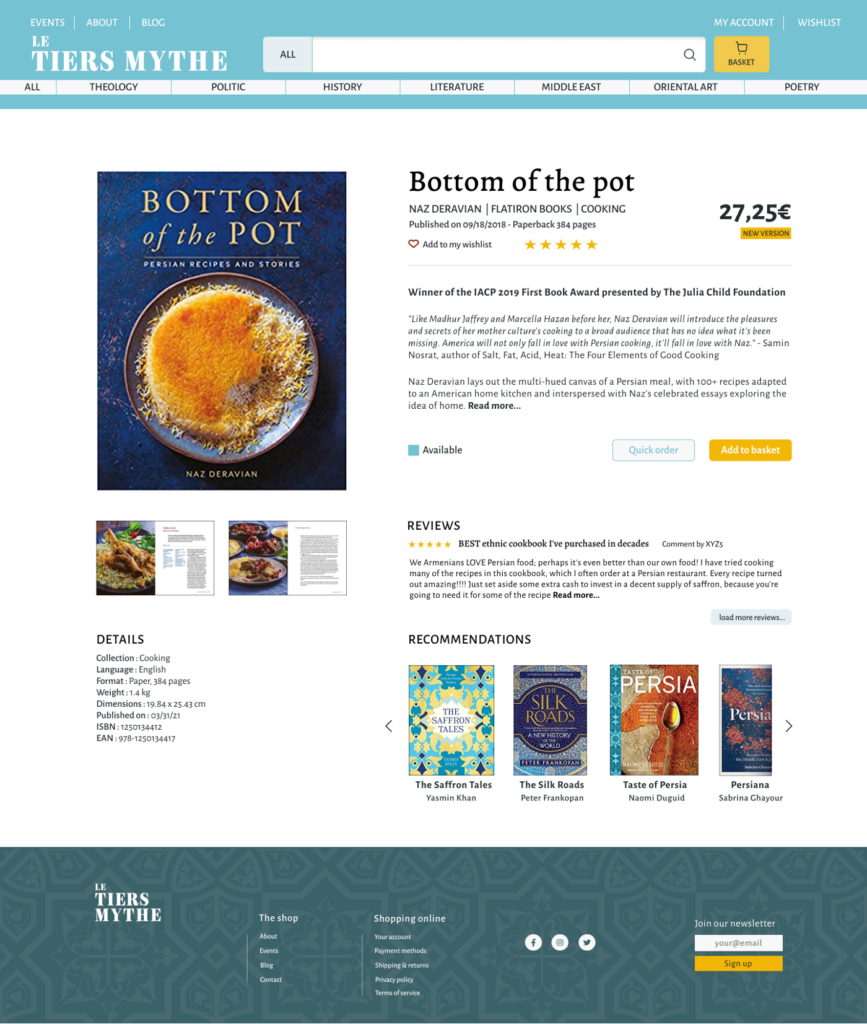
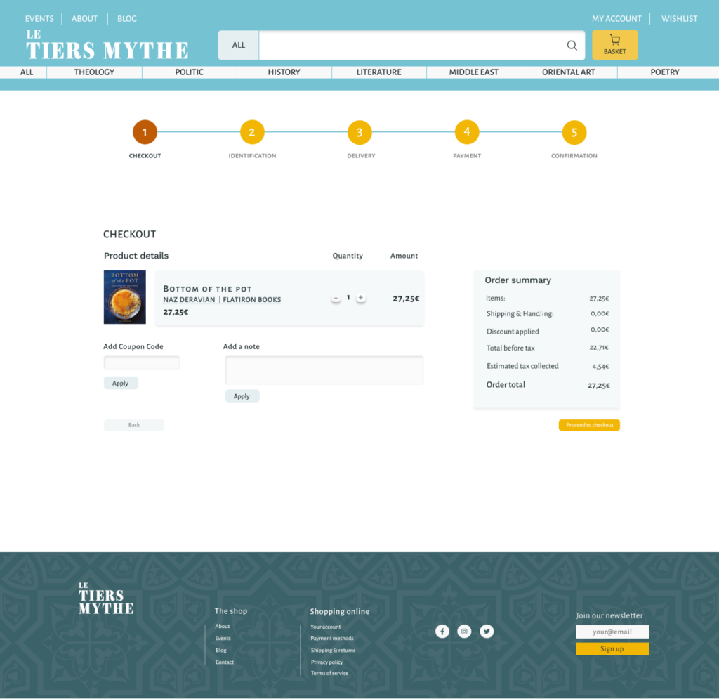
By using the quick order button the user can directly order the book, and all the order summary is showing the price of the order at all times during the whole process, leave a note to the shop, add a coupon, change quantity.
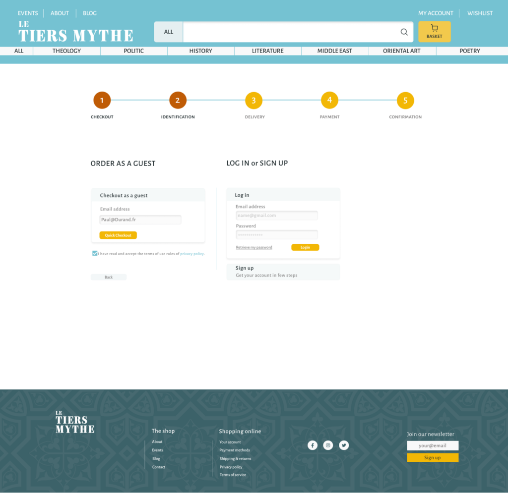
On the second step the user can choose either to login or sign up. We choose not to sign up because the user in this case, does not want to waste time creating an account.
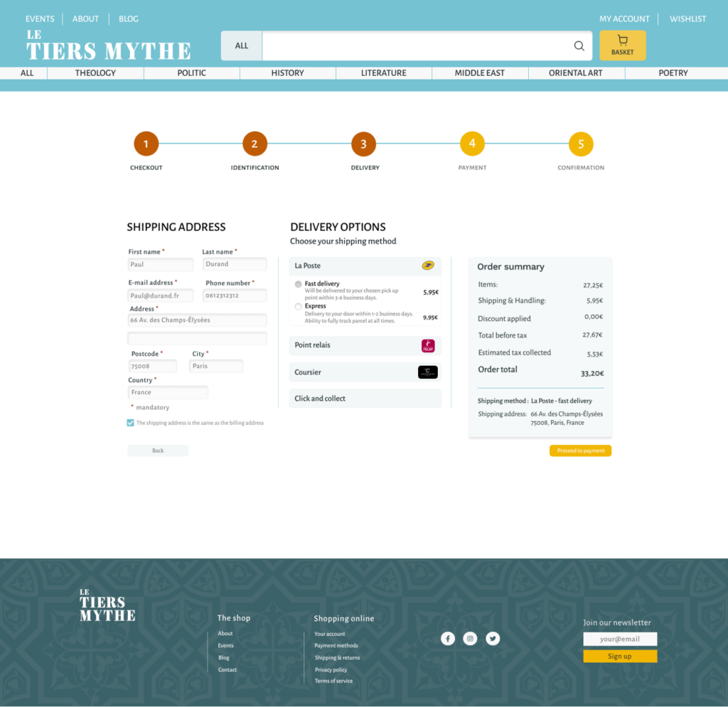
The user is asked basic information, name, last name, address, phone number and chooses a delivery method. Changes are applied on the order summary.
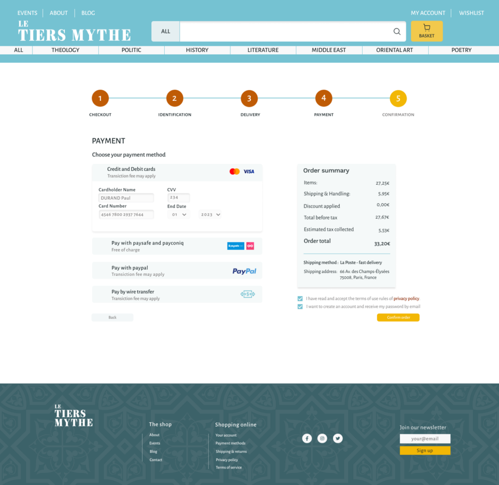
During the payment process the user can choose how to pay and sees the changes on the order summary. At the very last part of the process, the user has to agree to terms of use from the website and right below, if the user wishes it, he/she can create an account by ticking the last box a password will be sent to their email account and all information will be saved.
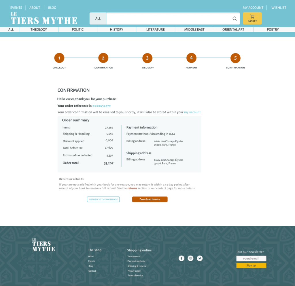
On the very last page of the process the user gets all the information about payment and can return to the main page or download the invoice.
