Leave no one behind
- What we saw
- Some of our patients have neither a mobile phone nor an e-mail address.
- The choice
- Dedicated journeys: booking by phone, on-site staff to help patients who struggle, and results on paper, on site or by post.
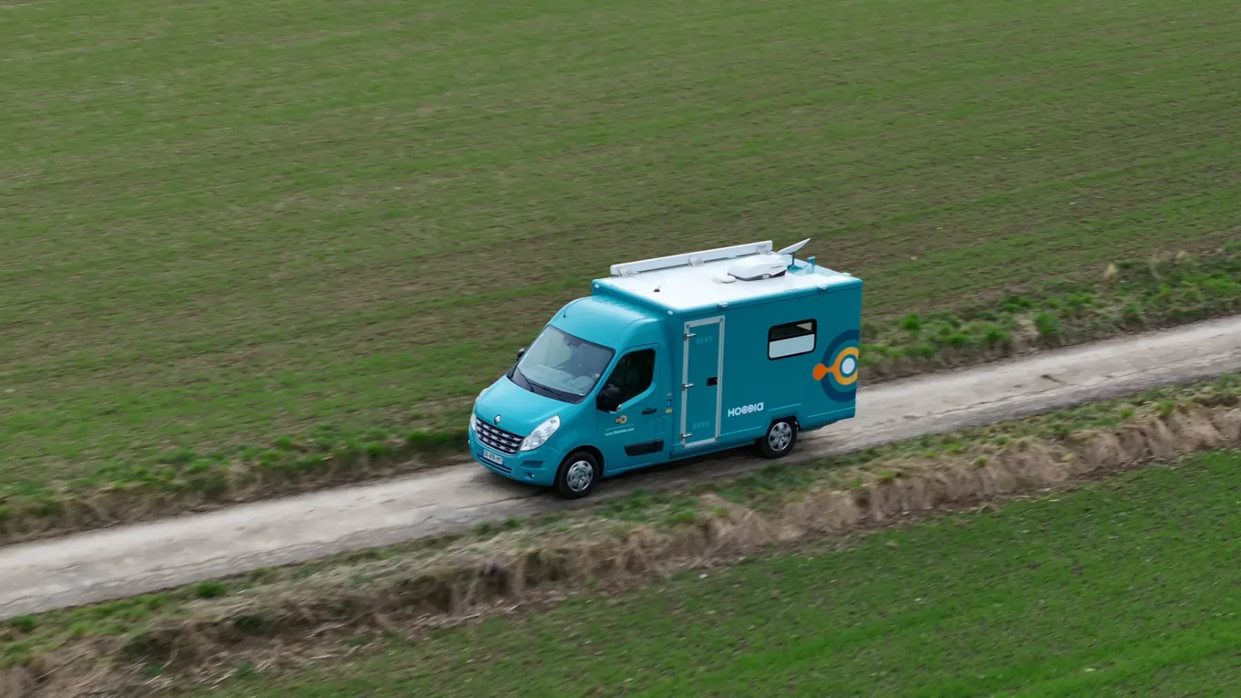
When the doctor is too far away, one person in five gives up on care. At Hocoia, I design the apps and the mobile practices that go to them.
In France, seeing a doctor has become an uphill battle for millions of people. About 6.4 million have no regular doctor. Outside the big cities, an appointment with a dermatologist can take up to nine months. And the less people see a doctor, the more their health declines.
The field surveys I ran confirmed it: about 20% of people give up on care entirely when the appointment is too far away, in distance or in time. It isn’t a lack of will. The system has become out of reach.
So Hocoia brings the practice to the patient: mobile, connected medical units, as close as possible to where people live. When I joined, a first identity existed, created with the Manaka studio in Lyon. But there was no app, no design system, and little knowledge of the people we were serving.
When patients can’t reach the practice, the practice comes to them.
Everything happens in the field: the experience has to work for the people on site, patients, healthcare professionals and reception agents alike. Many patients are comfortable with digital tools, but some are elderly or far from them, and others are anxious about a remote consultation. Caregivers on board (nurses, midwives, radiographers) work in a tight space and need to be fast and accurate. And healthcare is a heavily regulated field: every design choice has to work within those rules. These constraints shaped everything else.
I started with research: patient surveys, listening to caregivers and clients, competitor analysis, mapping the friction points.
The product moves forward in sprints of about three weeks, each followed by a testing phase. The team brings together the PO, the CTO and two development teams, one in-house, one external. The PO and the CTO prioritise features, and I join those trade-offs when some needs become more urgent. Work is tracked on a kanban board.
Some patients have neither a mobile phone nor an e-mail address. So the app had to offer two paths, which meet under the reception tent.
01Booking
With a phone or an e-mailSigns up and books online
Without phone or e-mailCalls the secretariat, which creates the account and sets the appointment
02Before
With a phone or an e-mailFills in a questionnaire tailored to the exam
Without phone or e-mailFills in the questionnaire by phone, with the secretariat
03Arrival
With a phone or an e-mailIs welcomed at the reception tent
Without phone or e-mailIs welcomed at the reception tent
04Consultation
With a phone or an e-mailHas the exams on board, the doctor consults remotely
Without phone or e-mailHas the exams on board, the doctor consults remotely
05Results
With a phone or an e-mailFinds them securely in their account
Without phone or e-mailReceives them on paper, on site or by post
I have worked on the UX and UI of the app from the start, as part of Hocoia’s tech team.
The app, used as a SaaS by clients such as hospitals, hasmore than five roles, each with its own tools. I also design custom features for these clients.
I also designed the video-consultation module, a full application that can run on its own or connected to the Hocoia app. It automatically collects readings from the connected medical devices: temperature, oximetry, spirometry, dermatology, ultrasound, stethoscope, heart rate, blood glucose, uric acid, among others.
To hold it all together, I built the app’s design system from scratch, on my own, with Figma, Claude Code and ChatGPT: foundations, components and rules, accessibility (WCAG) included, a base the product can grow on without starting over on every screen.
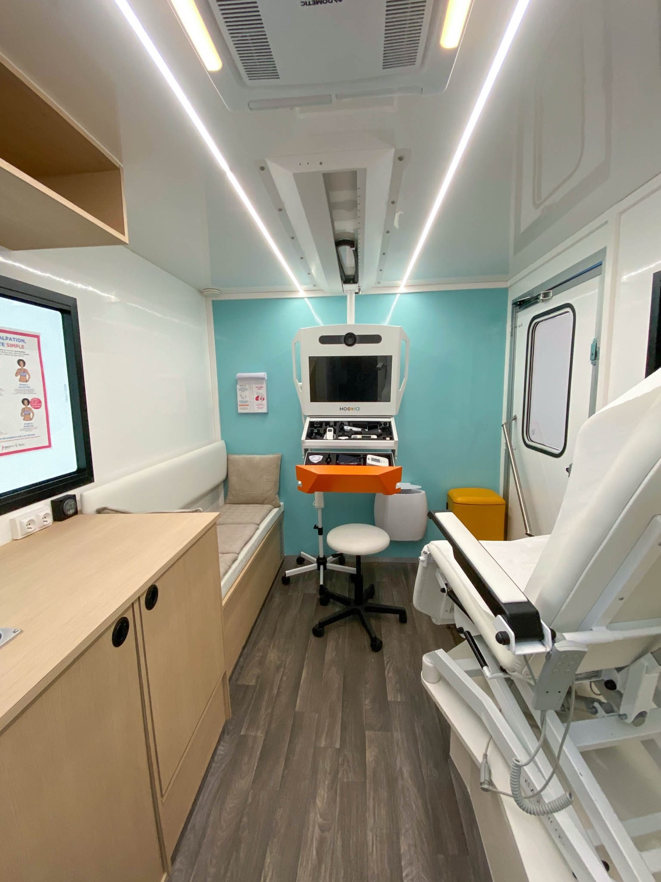
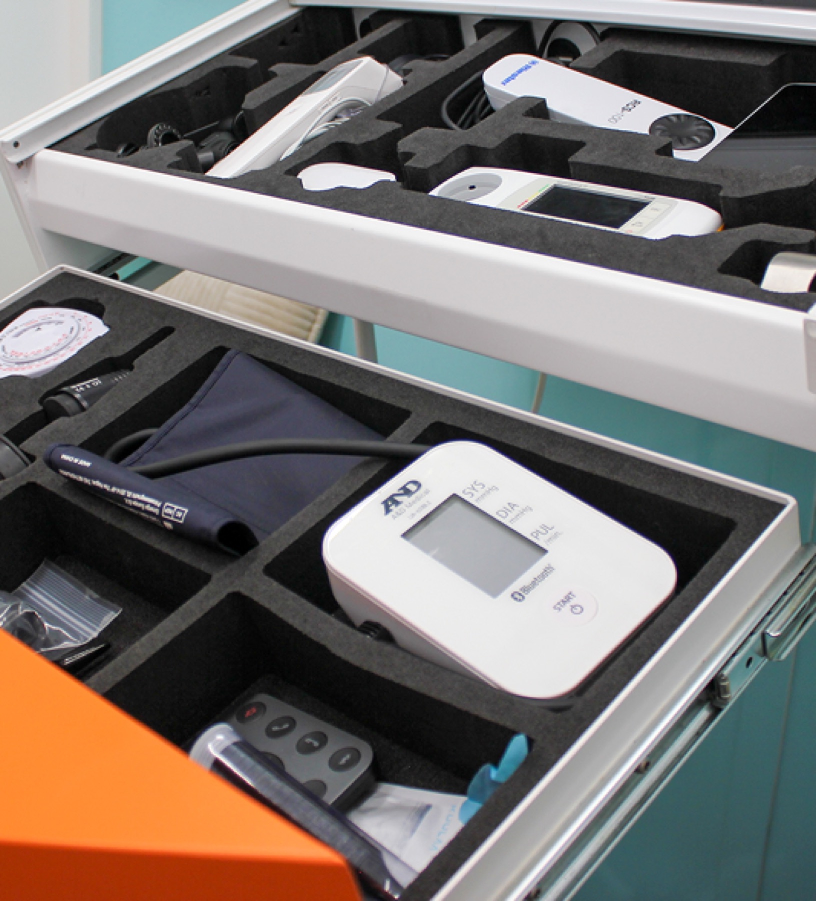
Reception happens under a tent at the back of the vehicle; only the consultation takes place on board. The reception agent had no place in the app. Here is their day, before and after.
01Preparing the day
BeforeA paper list or an Excel file, quickly outdated
With the appThe day’s schedule, always up to date
02Welcoming
BeforeThe agent doesn’t exist in the system
With the appChecks the patient’s identity and records their arrival
03Alerting the team
BeforeImpossible without interrupting the consultation
With the appA discreet notification, with no personal data
04Handling a no-show
BeforePhone calls to the secretariat, then waiting for the consultation to end
With the appThe reason is recorded, the team can see another patient
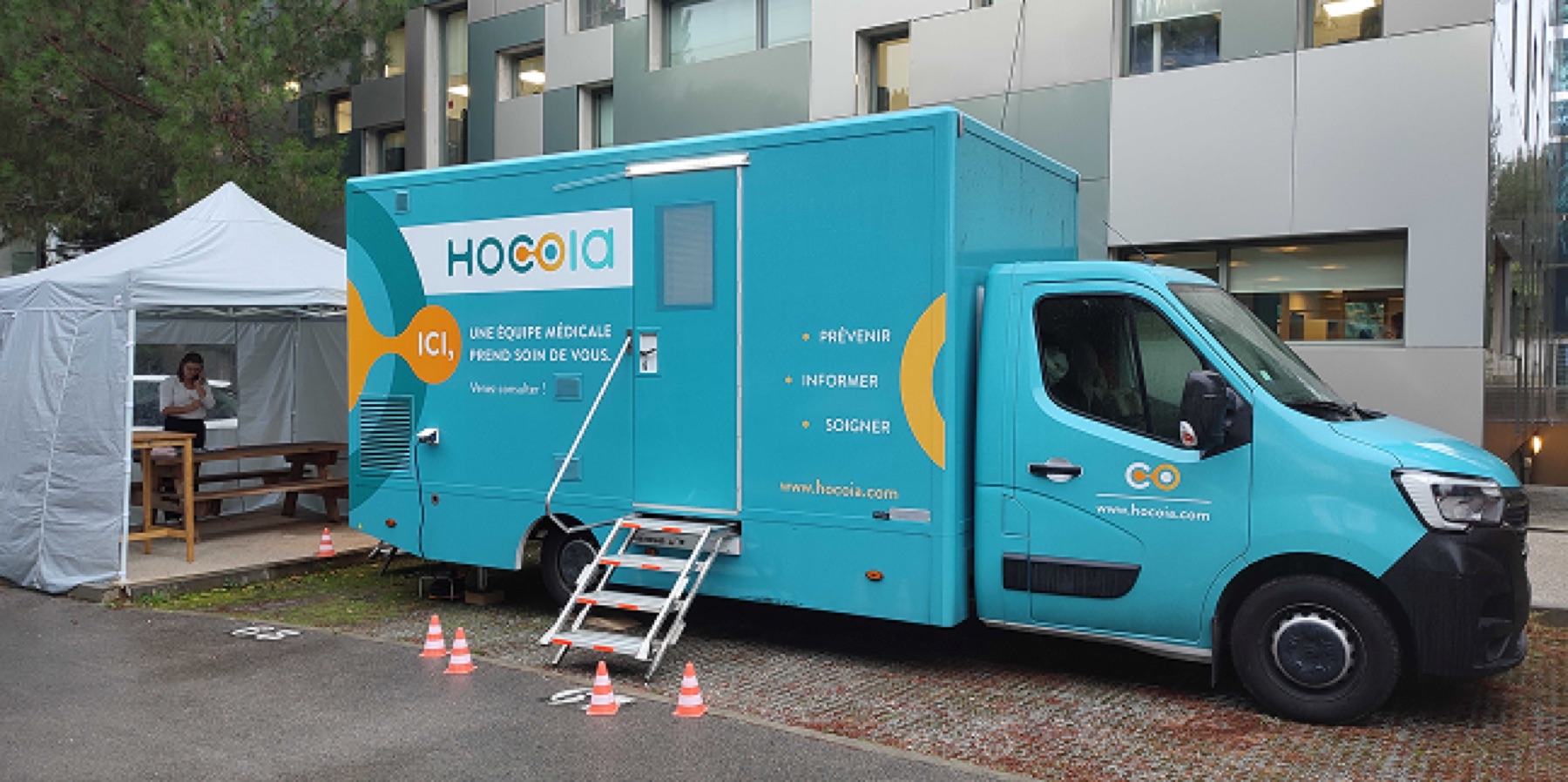
On several Médicobus and on the Mammobus, I worked on the layout of the medical practice, almost as a duo with the plan designer, starting from patients’ needs. Each project was a little different. The plans then went to the partners who build the vehicles. Alongside, I worked with clients on the vehicle wrap, often custom-made, and followed its installation to make sure the result was right. That’s where my work comes together: the vehicle and the app live in the same space.
The Mammobus was the most demanding project. Mobile mammography units are usually huge trucks that need a heavy vehicle licence and can’t go everywhere. Ours, presented as the smallest mobile mammography unit in the world, weighs 3.5 tonnes and can be driven with a standard car licence. It had to fit a mammography unit, an ultrasound scanner, two workstations and an access ramp, without sacrificing patient comfort or caregiver ergonomics.
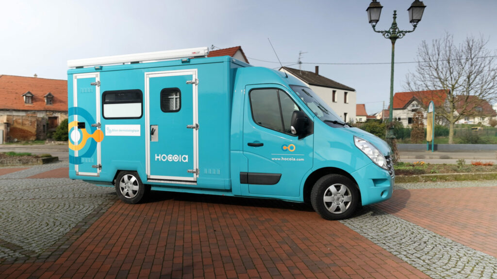
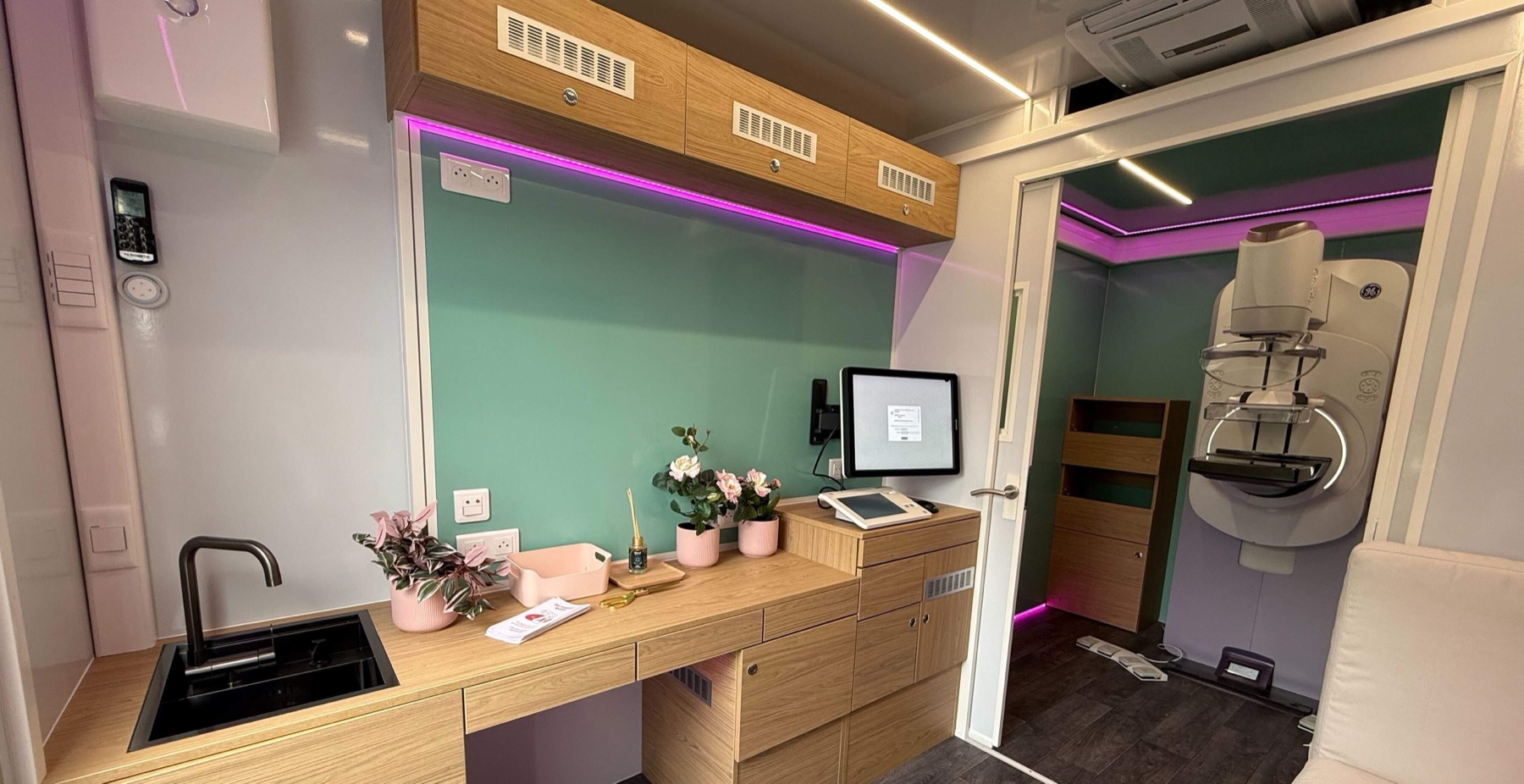
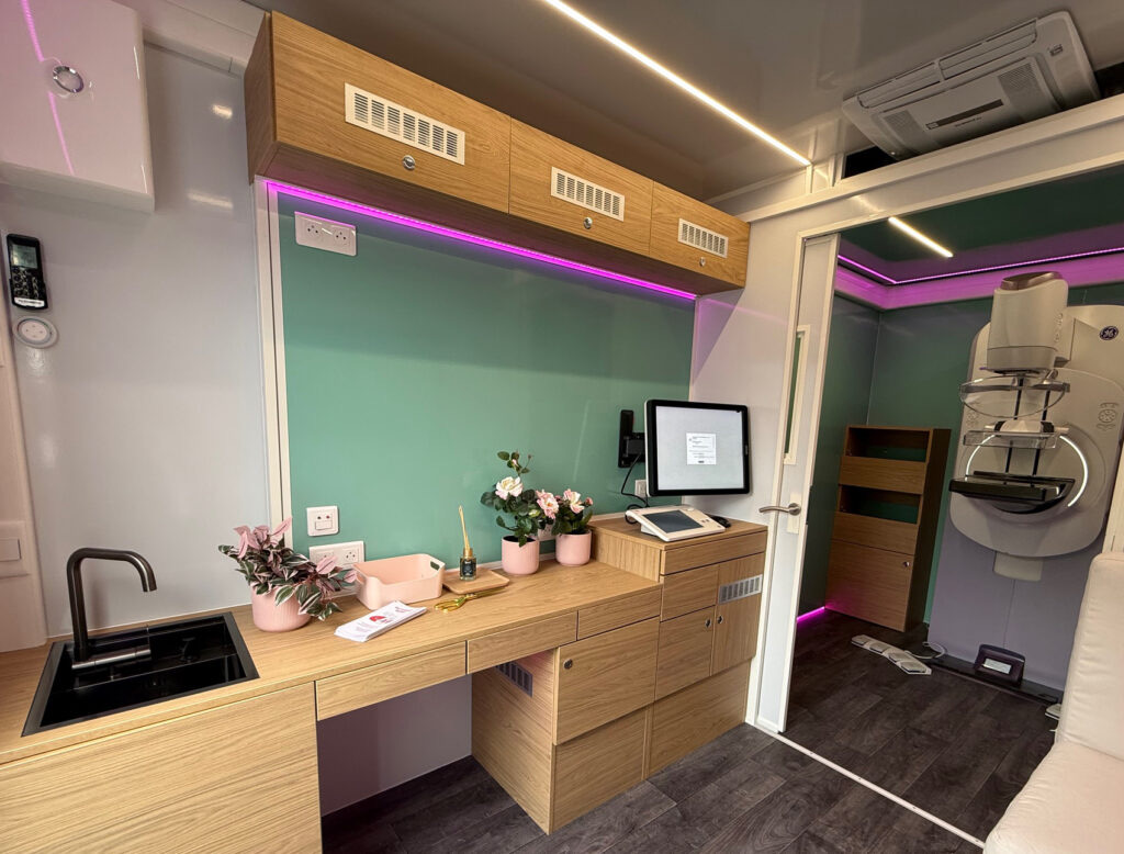
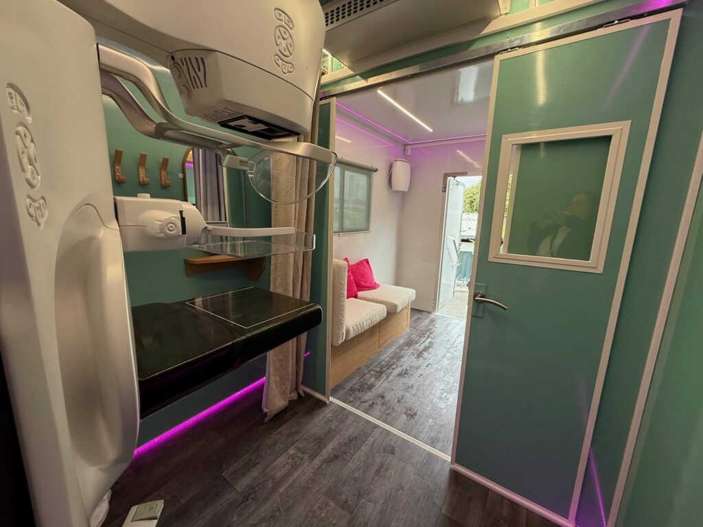
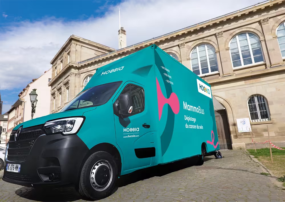
In 2026, I proposed bringing in the Graphéine agency to redesign the brand identity. The marketing team led the project, and I worked on it with them, all the way to the vehicle livery. Building on this new identity, I created a new design system, and the app is now being updated to match.

Nearly 10,000 patients have been able to see a caregiver thanks to these mobile units, often in places where they would not have had access to one otherwise. Today they offer screenings and consultations in dermatology, cardiology, respiratory health, women’s health, check-ups, and mammography with ultrasound. The Mammobus travels across France and carries out screenings regularly, with very positive feedback from patients.
“Thanks to this presence, I already feel less isolated, and safer, quite simply.”
“The initiative is more than sensible: it’s an experience to continue and make permanent.”
“Every patient expressed her satisfaction with this new service.”
And according to an MNT article from September 2025, residents say that without the Médicobus they would not have gone to see a doctor.
On television
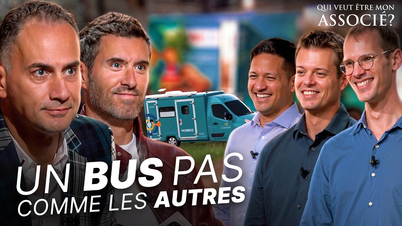
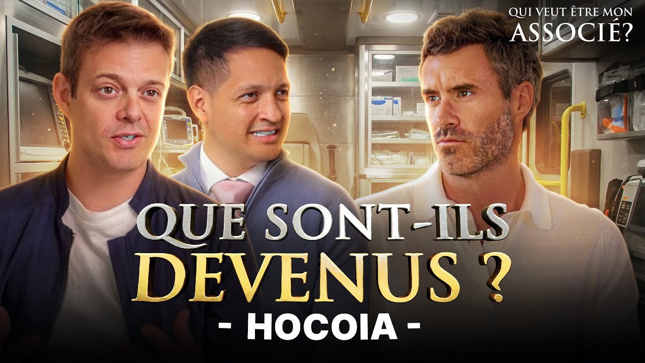
The Médicobus, whose interior layout and livery I designed, was presented on “Qui veut être mon associé?”, the French version of Shark Tank. Anthony Bourbon and Jean-Michel Karam invested in Hocoia, and the show came back to see the company a year later.
From a design token to a woman stepping into a bus in a village car park, that thread is what gives my work its meaning.
Interested in this work? Get in touch.